Custom WordPress & WooCommerce Systems Built for Real Businesses

I build custom WordPress and WooCommerce systems designed for real businesses, from competition platforms and e-commerce stores to booking engines and bespoke tools. Every build focuses on performance, clean architecture, and long-term scalability, giving you a fast, reliable platform that grows with your business.

Custom WordPress projects typically start from £699.

Check out my work

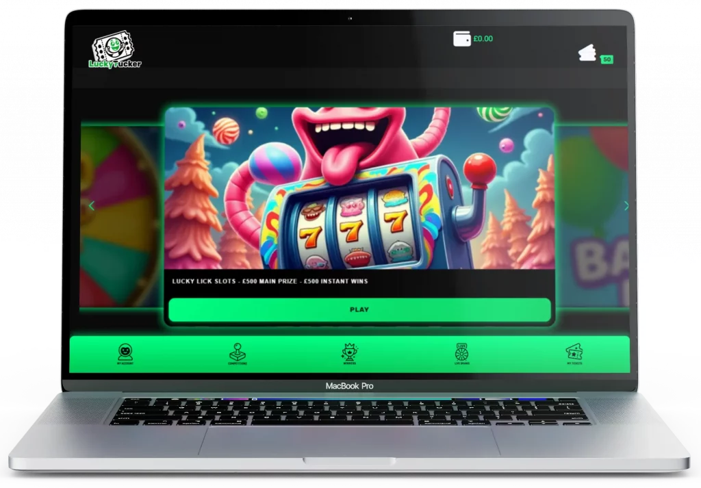
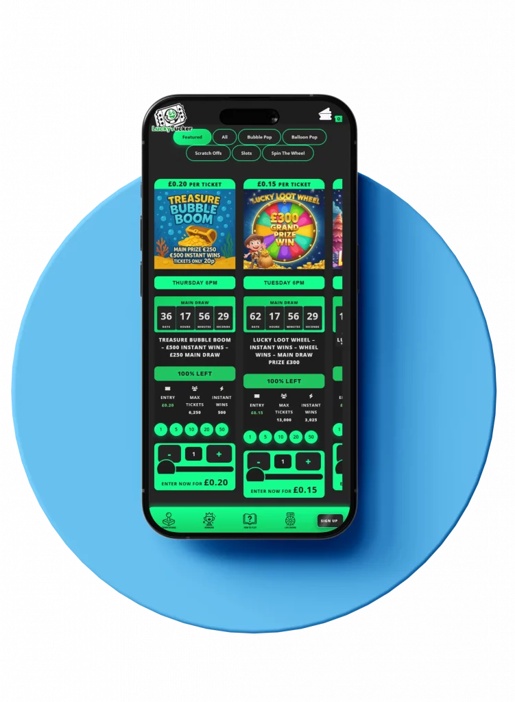
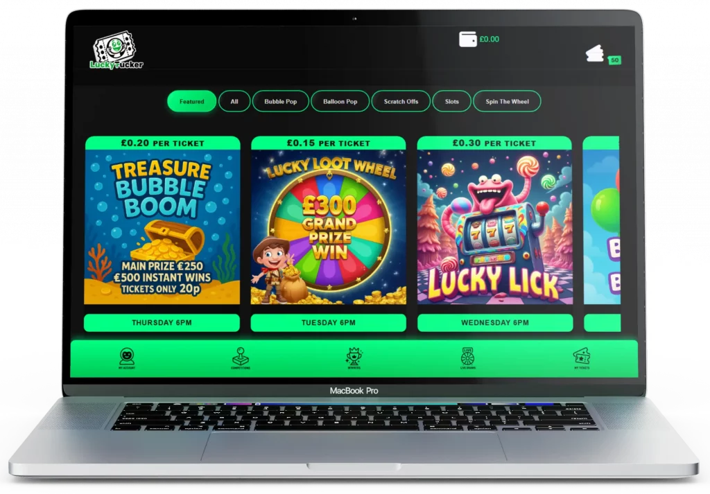
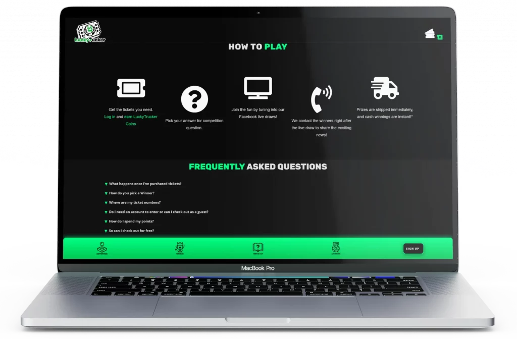
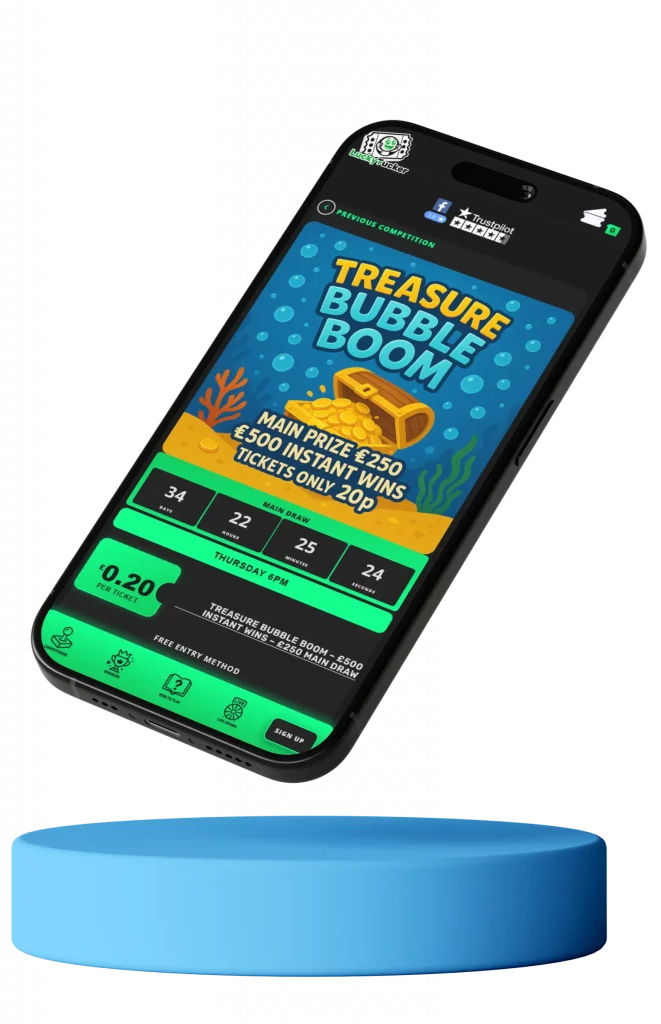
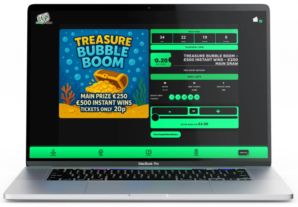
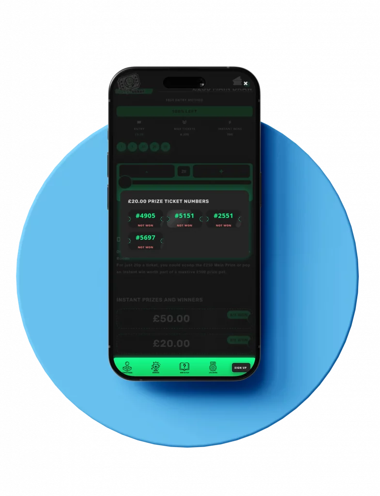
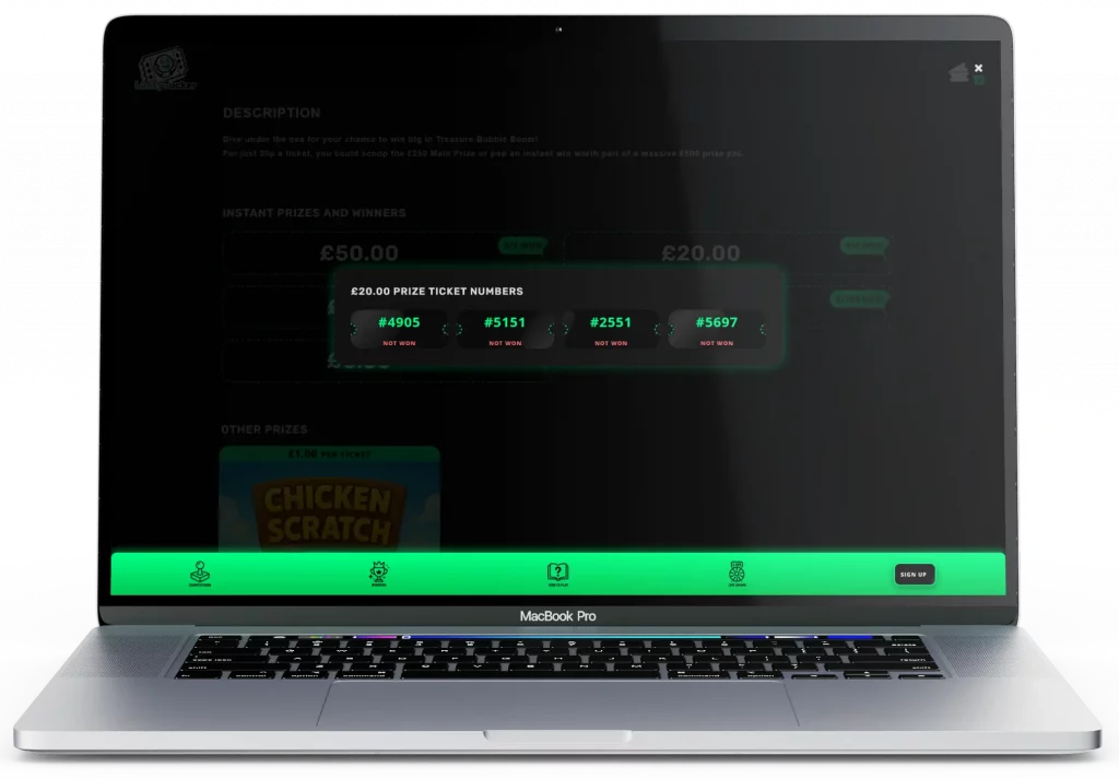
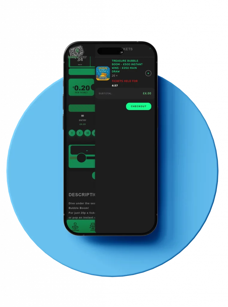
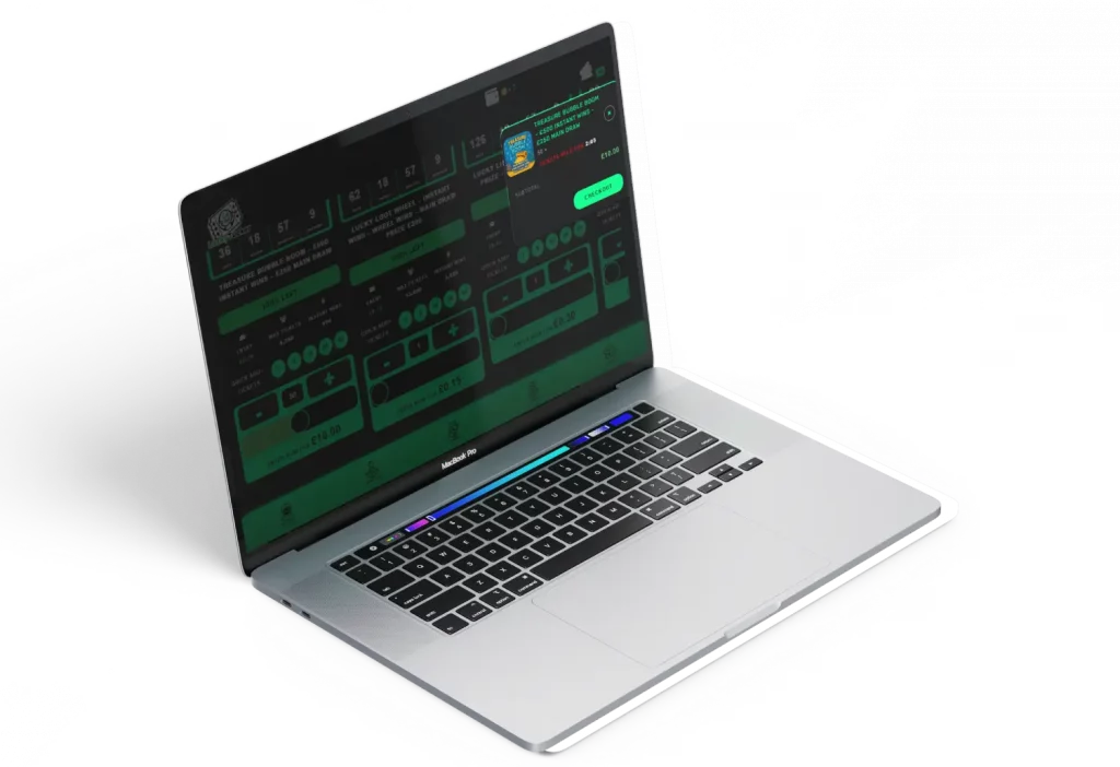
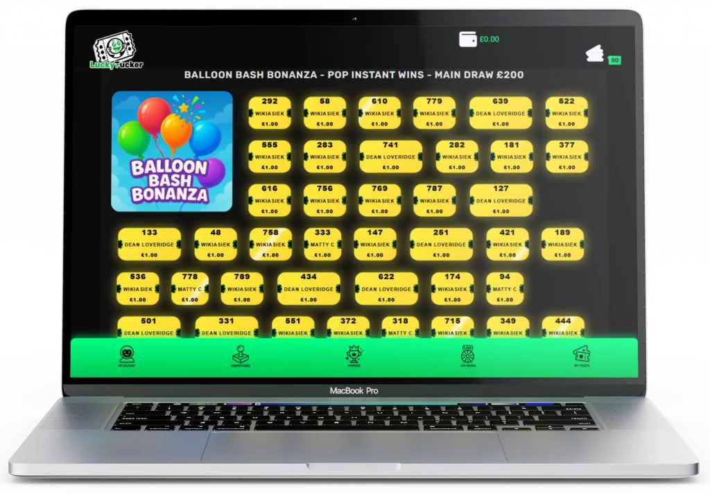
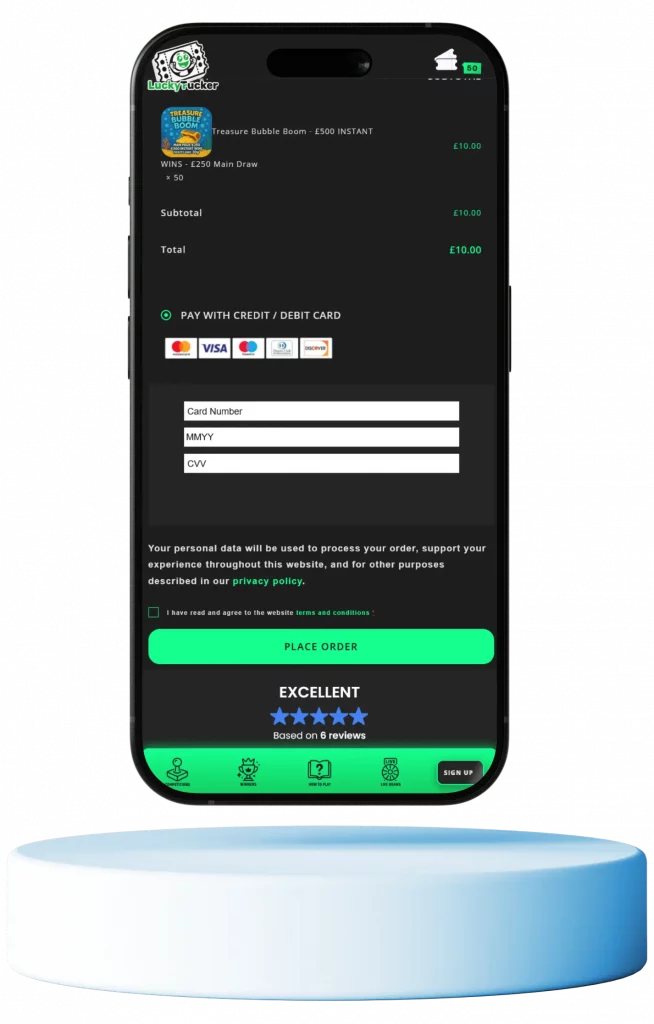
Competition Platform – WordPress Theme Generation System

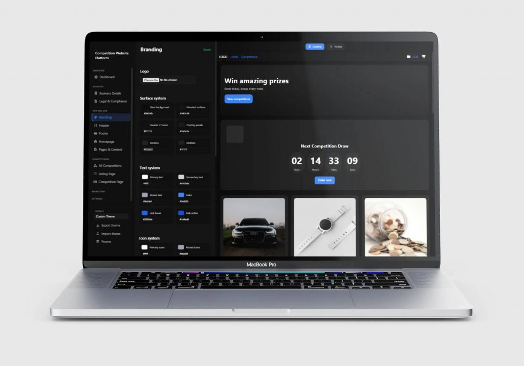
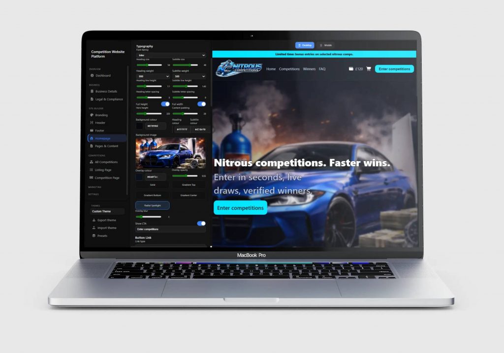
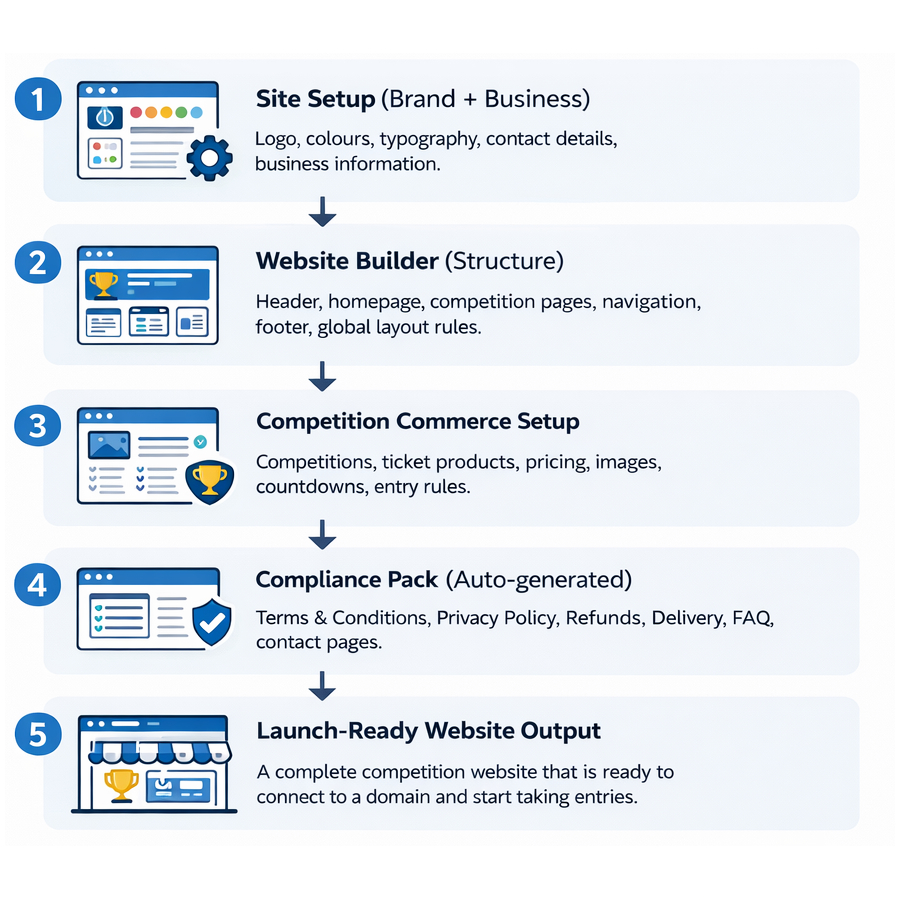
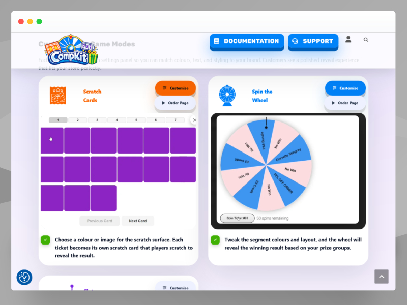
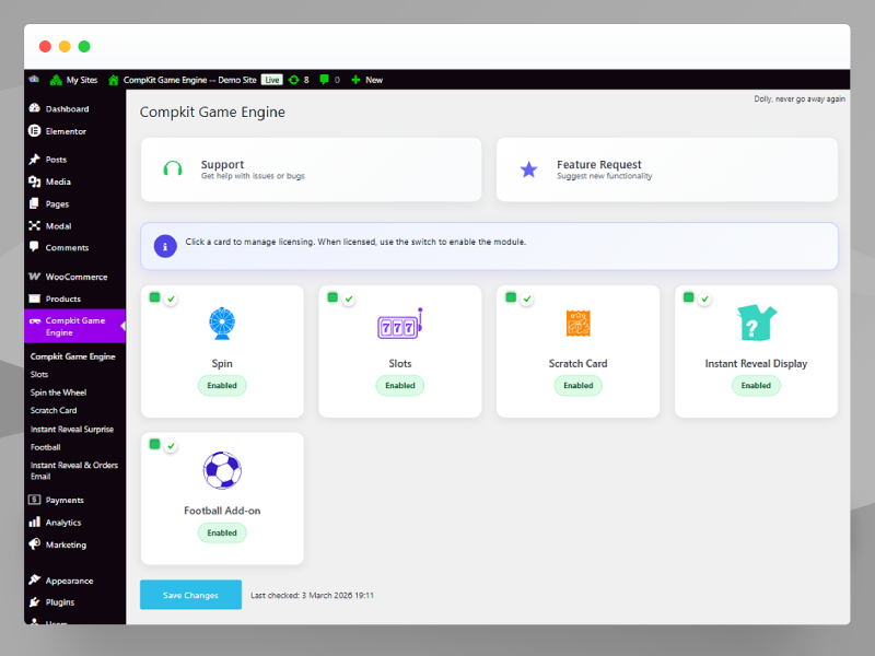
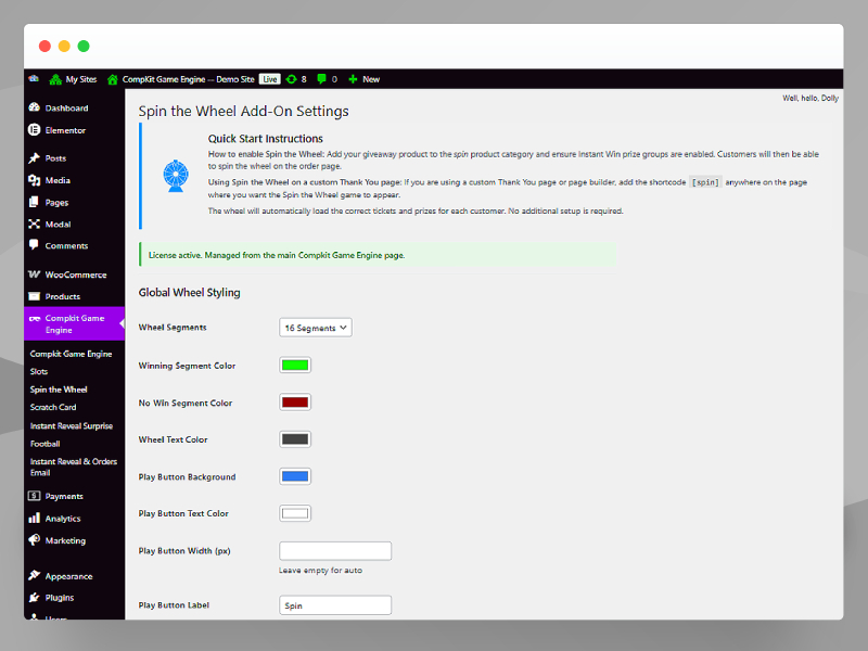
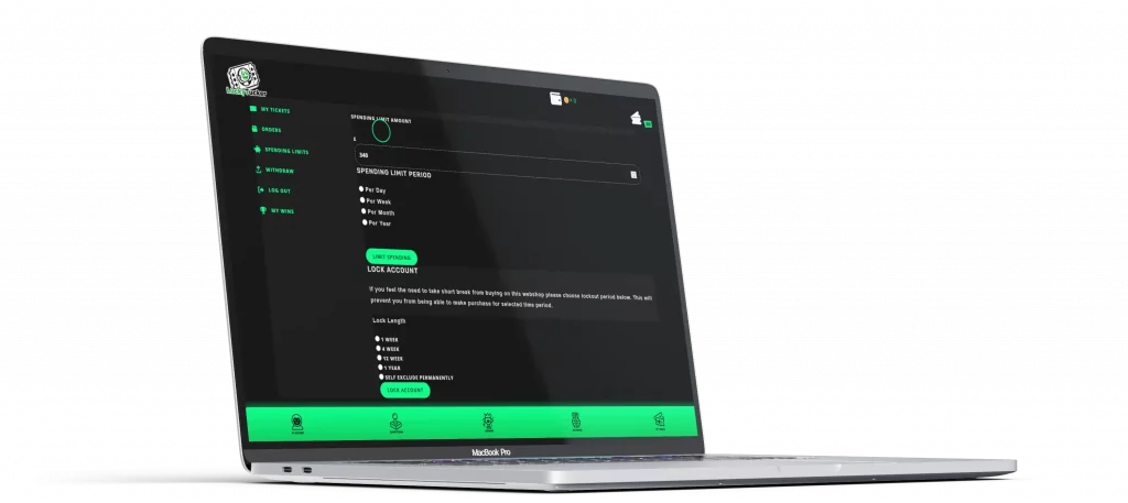
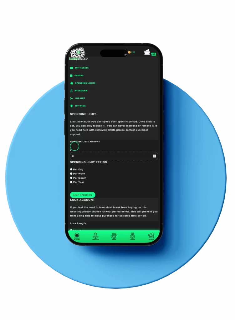
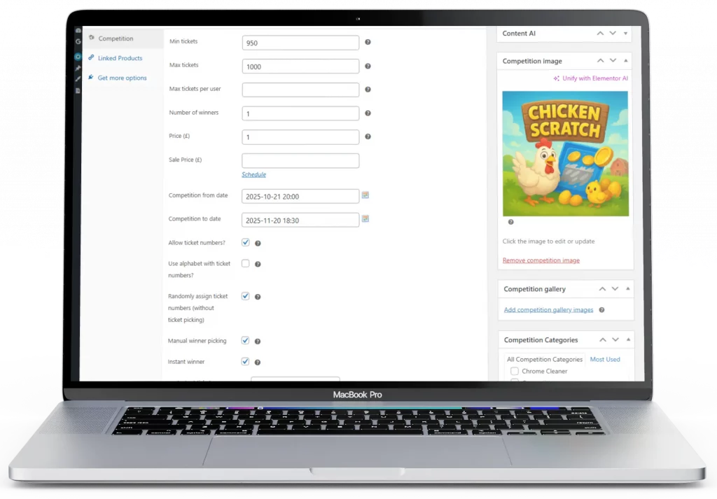
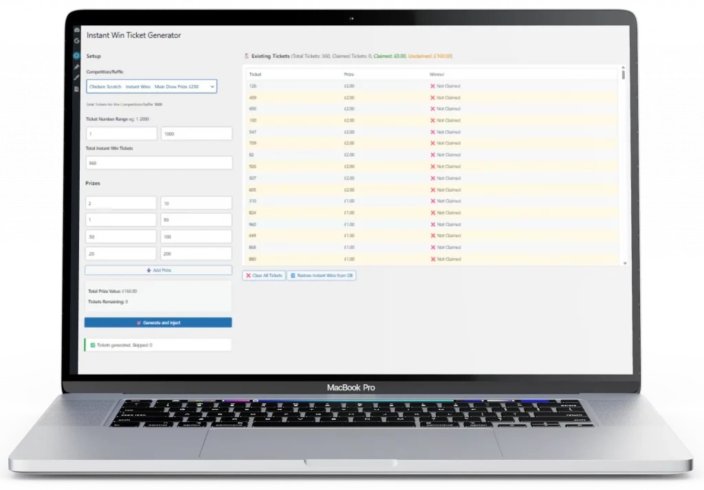
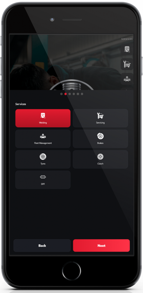
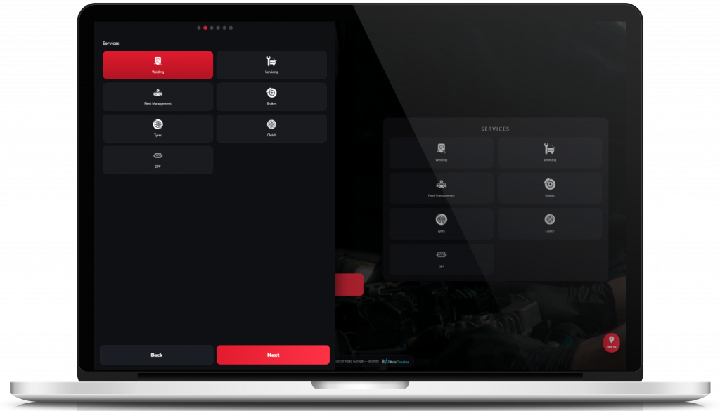
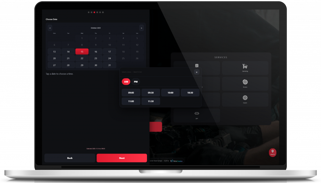
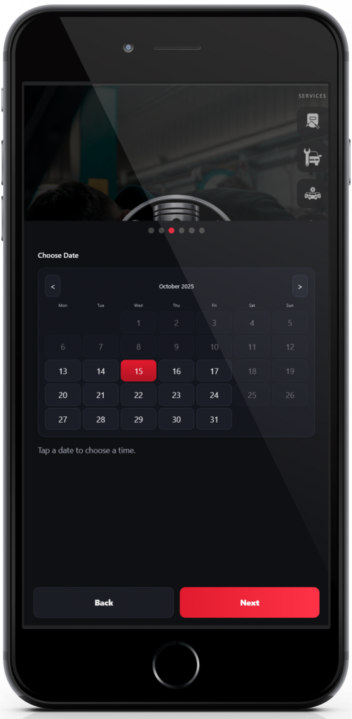
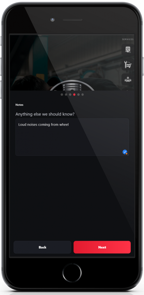
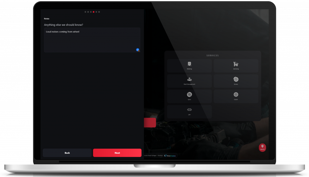
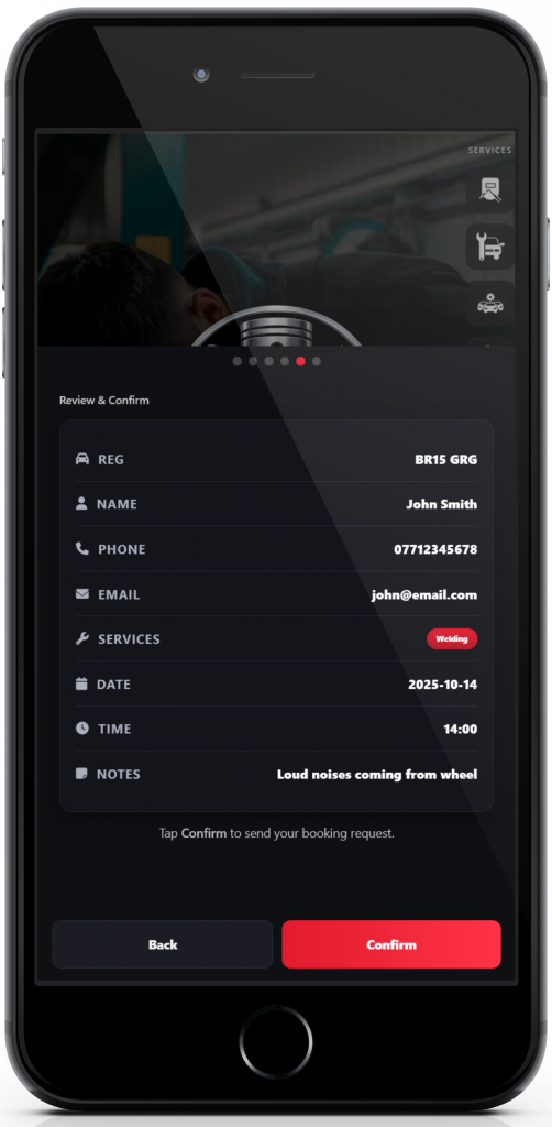
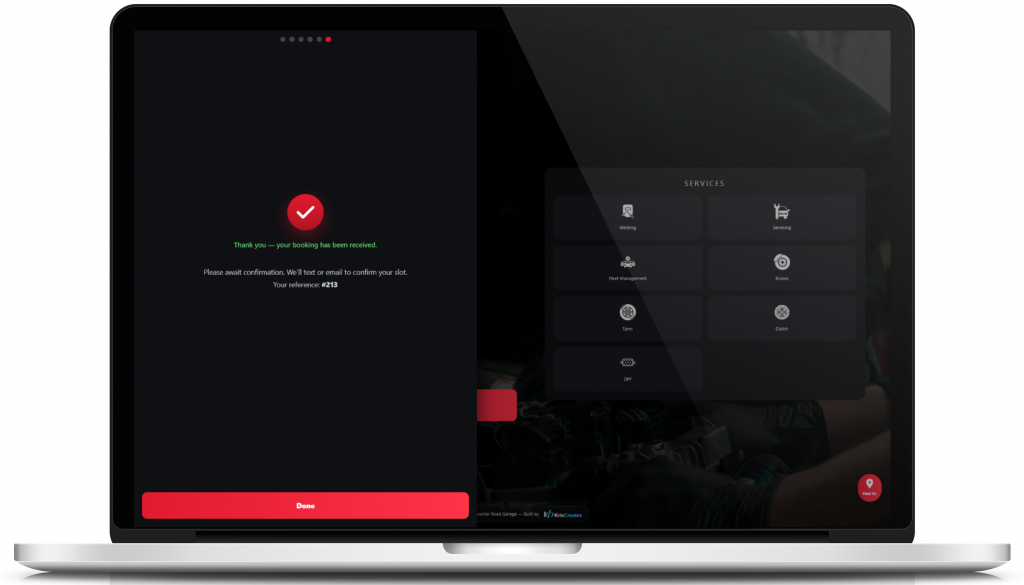
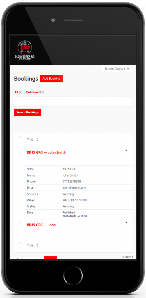
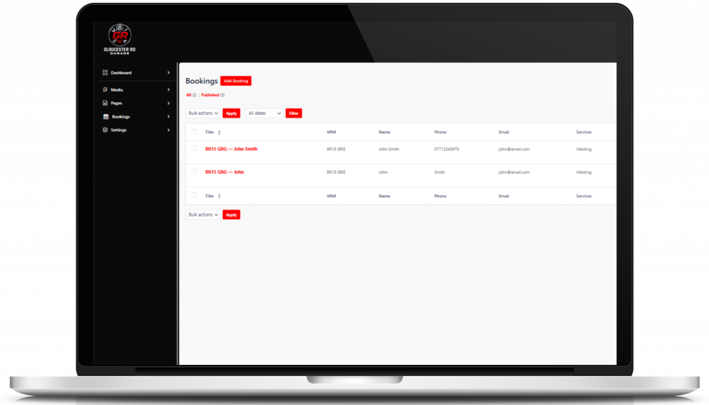
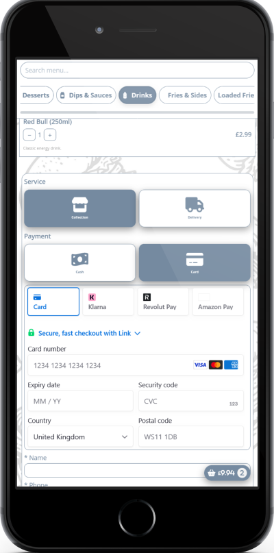
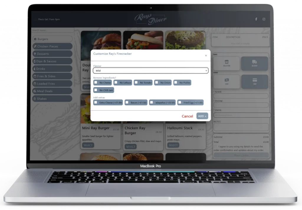
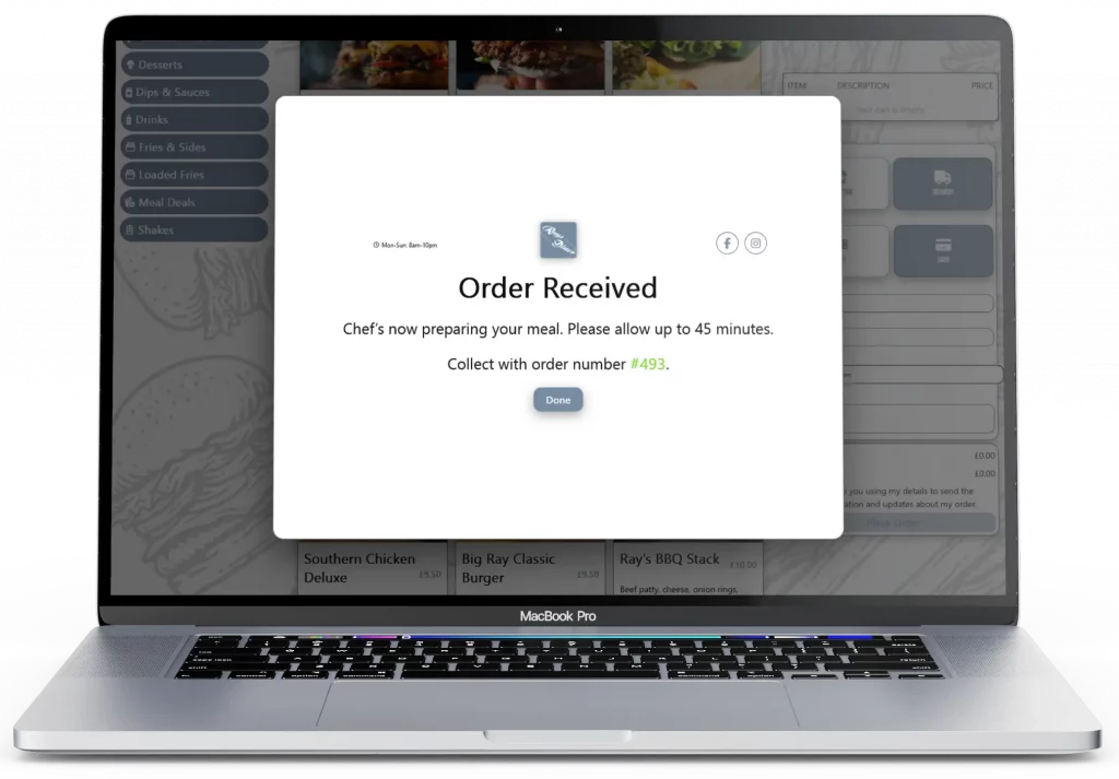
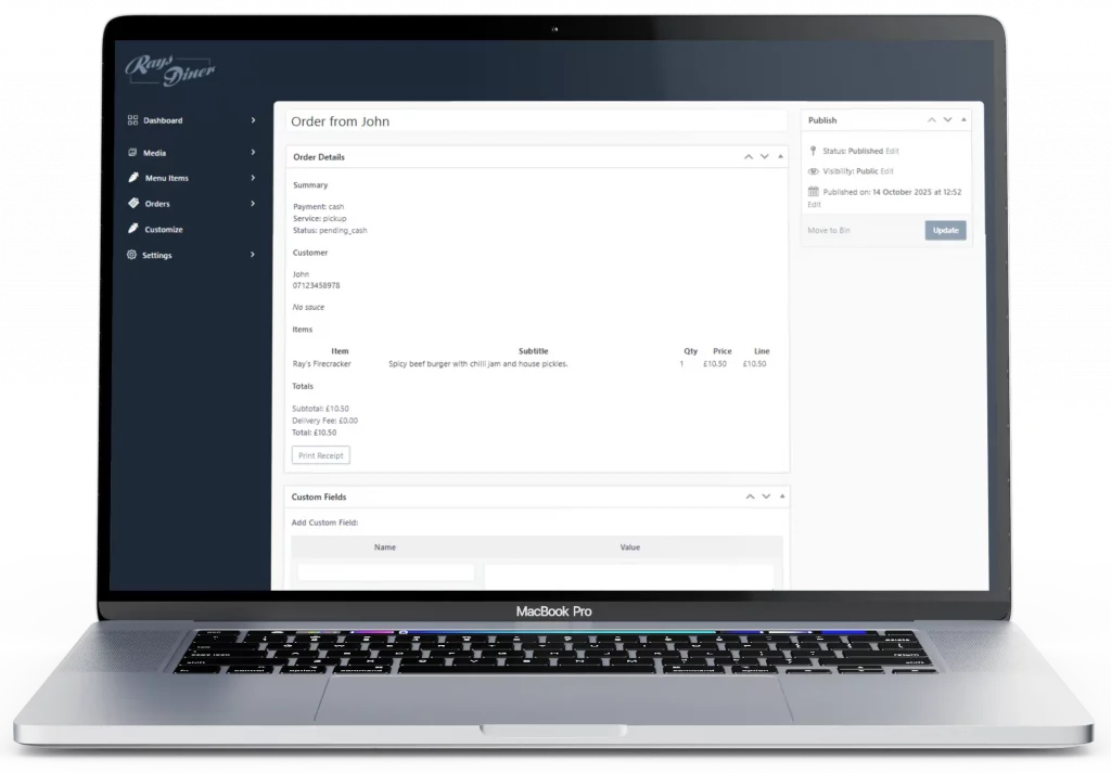
This project is a custom React-based competition platform designed to generate structured competition websites for WordPress. The system allows operators to configure branding, layouts, and competition structures before generating a ready-to-deploy storefront theme.
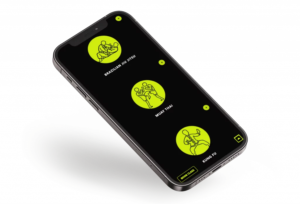
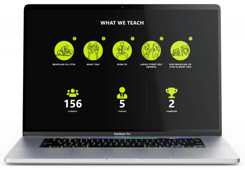
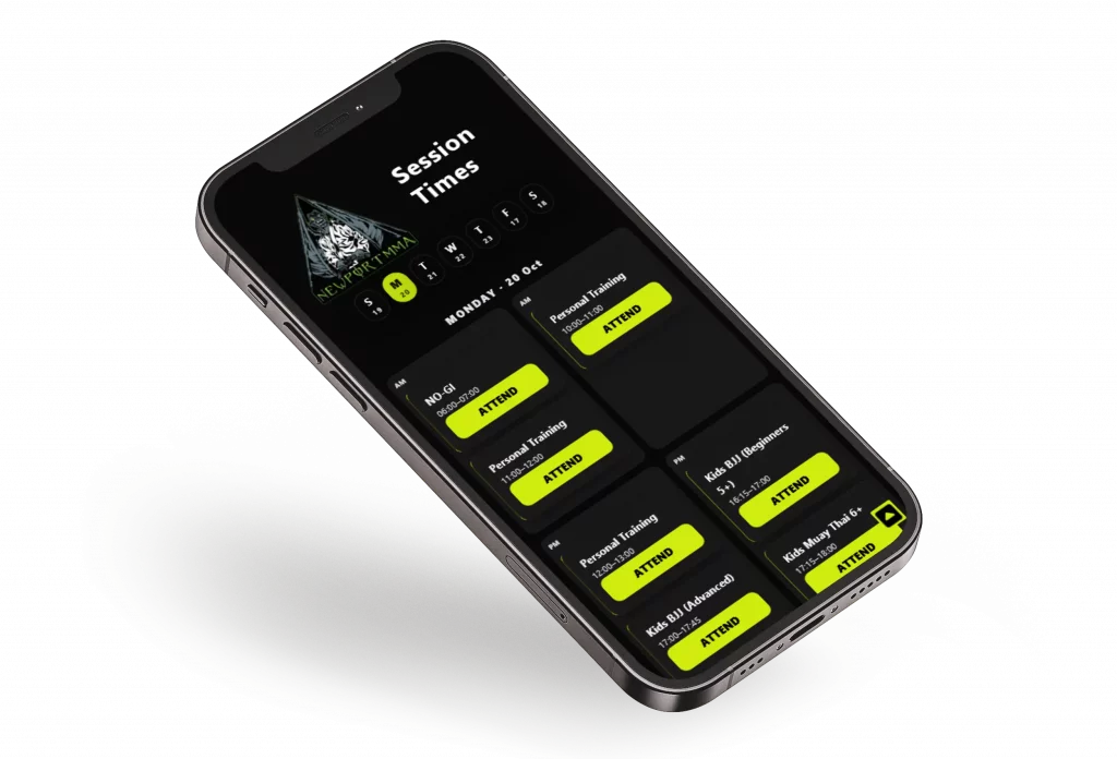
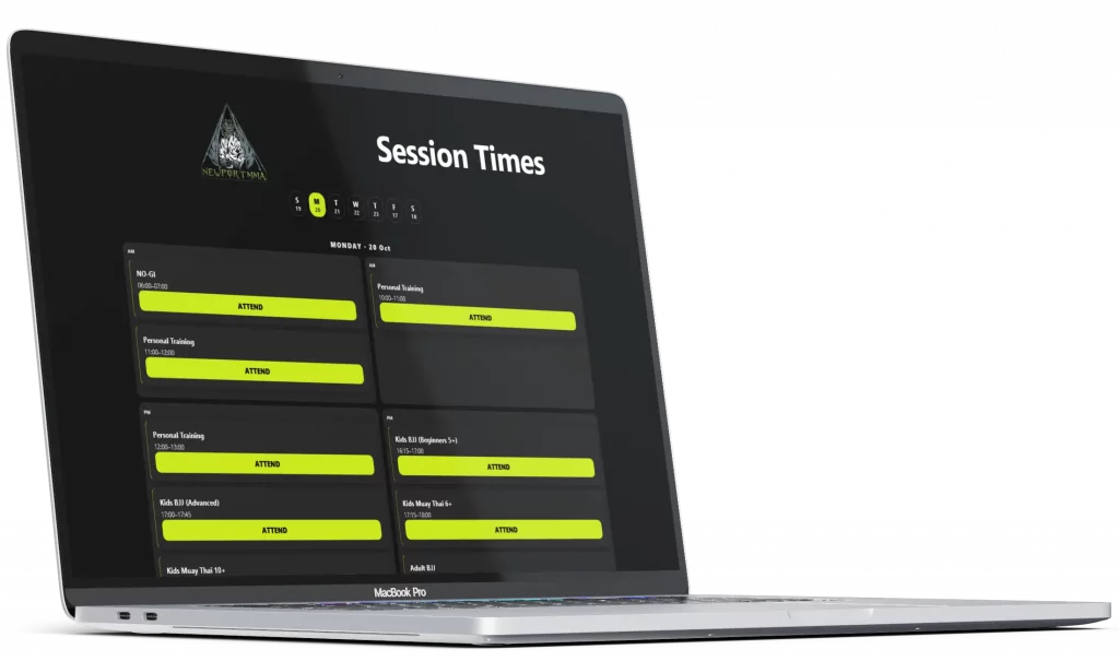
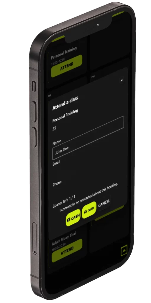
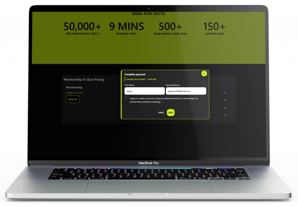
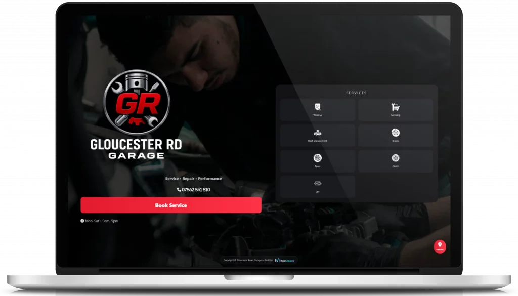
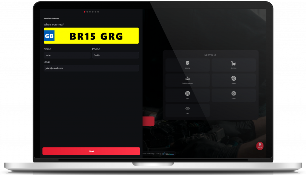
Swipe left
Platform Branding Configuration

Platform Branding Configuration

Initial configuration interface used to define the branding and visual identity of a competition website. The platform allows colour themes, typography, and layout settings to be configured before generating a complete WordPress competition storefront.

Generated Competition Theme (Nitro)

Generated Competition Theme (Nitro)

Example storefront generated using the platform configuration system. This demonstrates how the platform can quickly produce fully branded competition websites with structured layouts, promotional sections, and product grids ready for deployment.

Competition Website Platform Architecture

Competition Website Platform Architecture

Diagram illustrating the platform workflow used to generate complete competition websites. The system handles branding configuration, site structure, competition setup, compliance pages, and payment integration, producing a fully structured website ready for launch.

CompKit – WooCommerce Gamification Engine

CompKit is a custom WooCommerce plugin designed to introduce interactive game mechanics and engagement features into competition-based e-commerce platforms. The system includes a modular game engine supporting experiences such as scratch cards, spin wheels, and slot-style interactions, all managed through a dedicated admin dashboard for easy module control. These interactive frontend elements integrate directly with WooCommerce to handle prize logic and reward distribution, while the underlying structured plugin architecture ensures the system remains scalable, maintainable, and easy to extend.

Swipe left
Gamification Engine Demo Interface

Gamification Engine Demo Interface

Frontend interface demonstrating multiple interactive reward mechanics available within the CompKit engine, including goal-based games, instant reveal mechanics, scratch cards, and slot machine style interactions.

Spin the Wheel Reward Experience

Spin the Wheel Reward Experience

One of the engagement modules included in CompKit. This slot-style reward interface allows customers to trigger prize reveals using predefined probability and prize logic integrated with WooCommerce reward workflows.

CompKit Admin Module Dashboard

CompKit Admin Module Dashboard

Centralised admin interface allowing store operators to enable or disable gamification modules, configure gameplay mechanics, and manage reward logic directly from the WordPress dashboard.

Game Configuration Panel

Game Configuration Panel

Administrative settings panel used to configure game parameters such as prize groups, winning conditions, visual styling, and gameplay behaviour for individual gamification modules.

LuckyTrucker Competitions – Raffle Website

A custom WordPress raffle website built using the WP Genie WooCommerce Lottery plugin with advanced extensions I developed. Features include a unique instant ticket generating win system, five interactive JavaScript games, spending limits, real-time leaderboards, and a seamless, mobile-friendly user experience. Designed to make online competitions more engaging, transparent, and fun.

Swipe left
Landing Page (Mobile)

Landing Page (Mobile)

Responsive slide show formatted 9:16 for mobile that highlights each competition with a feature image and a clear ENTER NOW button. The screen includes a leaderboard for instant winners and top loyalty point collectors to drive urgency and social proof. A sticky footer game menu is always visible with quick links for account, competitions, winners, how to play, my tickets, and live draws so users can navigate and enter without scrolling. This layout increases engagement and makes entering competitions fast and friction free.

Landing Page (Desktop)

Landing Page (Desktop)

The desktop landing page features a full width 16:9 slideshow displaying active competitions with bold feature images and ENTER NOW buttons. The clean, immersive layout focuses entirely on the competitions, using large visuals and smooth transitions to grab attention. A fixed game menu remains at the bottom of the screen, providing quick access to key sections such as account, competitions, winners, and live draws while maintaining a clutter free experience.

Competition Categories and Cards (Mobile)

Competition Categories and Cards (Mobile)

Below the main slider, visitors can browse competitions by category or game mode. Clicking a tab instantly refreshes the content below using AJAX, showing only the selected competitions without reloading the page. Each competition card displays the ticket price in a top banner, the end date, and a live countdown timer. Beneath that are quick add buttons for 5, 10, 20, or 50 tickets and an instant add to cart button for fast entry. This section is built for speed and engagement, keeping users active and encouraging impulse participation.

Competition Categories and Cards (Desktop View)

Competition Categories and Cards (Desktop View)

This section displays competition categories alongside a horizontal scroll of competition cards. Users can select a category to filter the cards below, which show the ticket price in a banner, a feature image, and the competition end date. Three large cards are fully visible with a fourth partially in view, creating a clean, interactive browsing experience that mirrors mobile while highlighting key competition details.

How to Play and FAQ (Mobile)

How to Play and FAQ (Mobile)

This section guides users through participating in competitions using large, clear icons paired with concise descriptions for each step. Beneath the instructions is a FAQ section addressing common questions about tickets, games, and prizes. The layout ensures both desktop and mobile users can quickly understand how to play, reducing friction and increasing engagement.

How to Play and FAQ (Desktop View)

How to Play and FAQ (Desktop View)

The desktop view presents the How to Play section in a clean grid layout with large icons and short, clear descriptions explaining each step of entering a competition. Beneath this, a neatly organized FAQ section answers common questions about gameplay, ticket purchases, and winnings. The layout focuses on clarity and professionalism, helping new visitors quickly understand the process while building trust in the platform.

Single Competition Page (Mobile View)

Single Competition Page (Mobile View)

The single competition page delivers all key details at a glance - vibrant artwork, prize amount, ticket price, and live countdown timer. The layout is optimized for one-handed use, with an u201cEnter Nowu201d button and ticket quantity selector always in easy reach. This design transforms a standard raffle page into a visually engaging, gamified experience that drives higher participation and user engagement.

Single Competition Page (Desktop View)

Single Competition Page (Desktop View)

The desktop layout expands the competition view into a bold, full-width presentation. Key information - prize amount, ticket price, draw countdown, and entry options - are clearly displayed alongside the feature image. The design emphasizes clarity and excitement, encouraging users to take part while maintaining a professional, trustworthy aesthetic that enhances brand credibility.

Instant Win Prizes Section (Mobile View)

Instant Win Prizes Section (Mobile View)

The mobile view shows the instant win prize categories in a clean scrollable layout below the competition details. Each prize tier displays the number of winning tickets and their value, making it simple for users to see whatu2019s available. When a category is tapped, a modal opens showing animated ticket numbers that sparkle to create excitement. Winning tickets appear gold with the winneru2019s username below, adding a fun, interactive element to the experience.

Instant Win Prizes Section (Desktop View)

Instant Win Prizes Section (Desktop View)

The desktop layout highlights the instant win modal in full view, showing a large grid of ticket numbers with soft animated gleams that add movement and energy. Winning tickets are displayed in gold with the useru2019s name underneath, clearly showing whou2019s won. This section adds a polished, professional layer of gamification that keeps users engaged and builds trust through visible, real-time results.

Cart Experience (Mobile)

Cart Experience (Mobile)

On mobile, the mini cart slides in from the side of the screen when tickets are added. It shows the same ticket details and countdown timer, designed to be easy to view and interact with on smaller screens while maintaining the sense of urgency.

Cart Experience (Desktop)

Cart Experience (Desktop)

On desktop, adding tickets to the cart triggers the mini cart to drop down from the header. It displays the selected tickets along with a 5-minute countdown timer, emphasizing urgency and keeping users informed about their reservation window.

Winner Display (Desktop View)

Winner Display (Desktop View)

On desktop, the winner display expands into a wider layout showcasing current and ended competitions. Winning ticket numbers surround the main feature image, each clearly labeled with the winneru2019s name. The layout balances excitement and professionalism - perfect for showcasing transparency and trustworthiness to visitors exploring previous draws.

Winner Display (Mobile View)

Winner Display (Mobile View)

The mobile winner screen highlights completed competitions with a vibrant layout that draws attention to winning ticket numbers. Each ticket is displayed around the featured competition image, showing both the ticket number and the winneru2019s name. This design keeps engagement high by celebrating winners in a visually dynamic way while maintaining the same clean, consistent interface across all devices.

Checkout Page (Desktop)

Checkout Page (Desktop)

The desktop checkout page displays a detailed form for user information alongside thumbnails of the competitions and the quantity of tickets selected. This layout keeps all essential details visible at a glance, allowing users to review their selections while completing their purchase.

Payment Integration NoChex (Mobile)

Payment Integration NoChex (Mobile)

On mobile, the NoChex payment section adapts to smaller screens, keeping input fields and totals easily accessible. The interface is designed for quick, secure payments while maintaining clarity and usability on handheld devices.

Account Page Spending Limits (Desktop)

Account Page Spending Limits (Desktop)

The desktop account page allows users to set and manage spending limits. The interface displays current limits alongside editable fields and visual indicators, helping users quickly understand and control their ticket spending.

Account Page Spending Limits (Mobile)

Account Page Spending Limits (Mobile)

On mobile, the spending limits interface is streamlined for smaller screens. Users can easily view and adjust limits with clear, touch-friendly controls, ensuring account management remains simple and intuitive on any device.

Back-End Add Competition (Desktop)

Back-End Add Competition (Desktop)

The desktop back-end allows administrators to easily add new competitions. Users can set the competition title, ticket quantity, raffle settings, and upload an image. Selecting a category automatically determines the game users will play after checkout, streamlining content management and ensuring consistency across competitions.

Bulk Instant Win Ticket Generator (Desktop)

Bulk Instant Win Ticket Generator (Desktop)

This feature allows administrators to bulk-add tickets while monitoring the total prize value in real time. When instant prizes are won by customers, their wallets are automatically updated, ensuring a seamless and efficient prize distribution system.

Spin The Wheel Game Settings (Desktop)

Spin The Wheel Game Settings (Desktop)

The back-end interface allows administrators to configure the Spin The Wheel game. Additional prizes can be added specifically for the wheel giving precise control over game outcomes and ensuring a balanced and engaging experience for users.

Newport Mixed Martial Arts Academy – GYM MMA Website

Showcasing a fully responsive WordPress website for Newport Mixed Martial Arts Academy, featuring class schedules, online membership signups, secure payment processing, and mobile-friendly booking for sessions. Demonstrates expertise in building user-focused, high-performance websites with integrated scheduling and membership management systems.

Swipe left
Landing Page (Mobile View)

Landing Page (Mobile View)

Gym websites often struggle to capture attention on small screens. This mobile landing page solves that by presenting a clear hero section with the gyms logo, a concise story, and a prominent Quick Attend a Class button. Visitors immediately understand the gyms offerings and can start booking a session in just a few taps, reducing friction and increasing conversions.

Landing Page (Desktop View)

Landing Page (Desktop View)

On desktop, first impressions are critical. This landing page expands the hero area with full width visuals, headline, and story section while keeping the Quick Attend a Class button clearly visible. The layout highlights key offerings and encourages visitors to take action immediately, solving the problem of lost leads and improving engagement.

What We Teach (Mobile View)

What We Teach (Mobile View)

Many gym websites fail to clearly communicate the disciplines they offer. This mobile layout solves that problem by presenting large, scrollable icons for each fighting style including Boxing, Muay Thai, Brazilian Jiu Jitsu, and MMA. Users can quickly explore the gyms offerings with an intuitive touch interface that makes it easy to understand the value and variety of training options.

What We Teach (Desktop View)

What We Teach (Desktop View)

On desktop, this section uses a spacious grid layout to showcase each fighting style with icons and short descriptions. The design keeps information clear and visually appealing so visitors can quickly understand what the gym offers. It removes confusion and increases the chance of visitors booking a class.

Class Timetable (Mobile View)

Class Timetable (Mobile View)

Booking classes on mobile can be confusing with small schedules and unclear layouts. This mobile timetable fixes that by showing a clear weekly view with clickable days. Classes appear in a clean grid with bold titles and an obvious Attend button. Users can see availability at a glance and book a session in a few taps, improving convenience and engagement.

Class Timetable (Desktop View)

Class Timetable (Desktop View)

Desktop users need a full overview of the week to plan their training. This timetable displays all seven days at the top with sessions listed in a clear grid below. Each class includes a visible Attend button for quick booking. The layout improves usability and encourages members to schedule more sessions.

Attend Class (Mobile View)

Attend Class (Mobile View)

After pressing the Attend button, users can confirm their chosen class and enter any extra information. Everything is shown on one screen to keep the process fast and simple. This approach reduces drop offs and makes it easy for members to complete their booking without confusion.

Membership Signup (Desktop View)

Membership Signup (Desktop View)

Many gyms lose new members because the signup process is too complicated. This desktop flow fixes that by listing all plans with clear prices and benefits. Users can register and pay securely through Stripe in just a few clicks. The design builds trust, removes friction, and helps convert visitors into paying members efficiently.

Gallery and Testimonials (Mobile View)

Gallery and Testimonials (Mobile View)

Most gym websites struggle to build trust and show personality. This mobile layout fixes that by placing a gallery slideshow at the top and a testimonial slider below. Users can swipe through real photos of classes and facilities, then read genuine member feedback. The design keeps visitors engaged and builds confidence in the gyms community and professionalism.

Gallery and Testimonials (Desktop View)

Gallery and Testimonials (Desktop View)

On desktop, the gallery and testimonial sections use the full width of the screen for maximum impact. High quality images highlight the gym, coaches, and classes, while the testimonials below provide strong social proof. This combination improves credibility and encourages visitors to book a class or sign up for membership.

Map and Contact (Desktop View)

Map and Contact (Desktop View)

Many gym websites make it difficult for new visitors to find contact information. This desktop view solves that by combining an interactive location map with key contact details such as phone number, email, and address. Users can get directions or reach out directly from the page, improving accessibility and helping potential members connect with the gym easily.

Gloucester Road Garage – Service Booking Website

Showcasing a fully responsive WordPress website for Gloucester Road Garage, featuring a streamlined vehicle service booking system, mobile and desktop friendly interfaces, service selection, date and time scheduling, and admin dashboard for managing appointments. Demonstrates expertise in building user-friendly, fast-loading websites with secure, no-friction booking workflows.

Swipe left
Landing Page (Mobile View)

Landing Page (Mobile View)

The mobile homepage welcomes visitors with a clean hero section featuring the garages logo, contact info, and a bold Book a Service button. Designed for one thumb navigation, it provides quick access to services, phone number, and location details right from the top of the page. A Find Us button opens Google Maps for instant directions, making it easy for customers to locate the garage. The layout is optimized for fast loading and smooth browsing on smaller screens.

Landing Page (Desktop View)

Landing Page (Desktop View)

The desktop landing page expands the layout with a full width hero image, service highlights, and a clear call to action. It emphasizes trust and convenience with visible opening hours, a Find Us button, contact info, and a smooth scroll into the service and booking sections. The design is balanced and professional, establishing credibility for the garage at first glance.

Book Service Popup (Mobile View)

Book Service Popup (Mobile View)

After tapping Book a Service, a sleek pop up appears asking customers to enter their vehicle registration. Designed for fast interaction on mobile, the form uses large input fields and clear buttons, ensuring drivers can start the booking process in just a few seconds without leaving the current page.

Book Service Popup (Desktop View)

Book Service Popup (Desktop View)

On desktop, the same booking pop up overlays the page with a dimmed background for focus. The registration input field and submit button are centered and styled for clarity, guiding users smoothly into the next step of scheduling their service. It is a responsive, no reload experience that keeps the booking flow frictionless.

Select Service Type (Mobile View)

Select Service Type (Mobile View)

Once the customers vehicle registration is entered, the next step displays a clean, scrollable list of available services including MOT, Full Service, Interim, Repairs, and more. Each option uses bold buttons and icons for easy tap selection on mobile. The layout is designed to minimize typing and make the booking flow intuitive, even on smaller screens.

Select Service Type (Desktop View)

Select Service Type (Desktop View)

On desktop, the service selection expands into a wider, grid based layout showcasing each service type with clear labels and short descriptions. Hover effects highlight the users choice, and once selected, the system moves smoothly to the next booking step. This screen emphasizes clarity, usability, and a professional service presentation.

Select Date and Time (Desktop View)

Select Date and Time (Desktop View)

On desktop, the calendar and time slots are displayed side by side for a clear overview of availability. Users can hover over available slots for more information and select their preferred date and time in a single, fluid interaction. The layout emphasizes ease of use while maintaining a professional, trustworthy look.

Select Date and Time (Mobile View)

Select Date and Time (Mobile View)

After selecting the service, customers can choose their preferred appointment slot. The mobile interface presents a clean, scrollable calendar and time picker optimized for touch interaction. Users can quickly see available dates, select a convenient time, and proceed without unnecessary taps or page reloads.

Problem Description and Notes (Mobile View)

Problem Description and Notes (Mobile View)

Customers can provide additional details about their vehicle or specific service requests. The mobile interface uses a clean, scrollable text area with clear labels, ensuring users can type their notes comfortably. This step helps the garage understand the customers needs before the appointment, all without leaving the booking flow.

Problem Description and Notes (Desktop View)

Problem Description and Notes (Desktop View)

On desktop, the notes field is spacious and prominently positioned next to the booking summary. Users can easily add comments or describe any issues with their vehicle. The layout keeps the process intuitive while showing the full context of the booking, reducing errors and unnecessary follow ups.

Booking Summary (Mobile View)

Booking Summary (Mobile View)

Before final submission, the mobile summary screen consolidates all the information the customer has entered including vehicle registration, selected service, date and time, and any notes or special requests. This gives the user a final chance to review and confirm their choices, ensuring accuracy and building confidence before completing the booking.

Booking Confirmation (Desktop View)

Booking Confirmation (Desktop View)

On desktop, the confirmation page displays the thank you message alongside the booking number and key appointment details in a clean, organized layout. The design ensures users can quickly reference their information, print or save it if needed, and feel confident that their booking is confirmed.

Booking Confirmation (Mobile View)

Booking Confirmation (Mobile View)

After completing the booking, the customer sees a clear confirmation screen with a thank you message and a unique booking number. The mobile layout emphasizes readability and reassurance, confirming that the appointment has been successfully scheduled and that the garage will be in touch shortly.

Admin Booking Dashboard (Mobile View)

Admin Booking Dashboard (Mobile View)

The mobile admin dashboard allows garage staff to view incoming bookings on the go. Each booking is listed with key details including customer name, vehicle registration, selected service, date and time, and notes. Staff can quickly tap to see more information or mark a booking as confirmed, all from a compact, mobile friendly layout.

Admin Booking Dashboard (Desktop View)

Admin Booking Dashboard (Desktop View)

The desktop dashboard displays bookings in a full table layout, giving staff a comprehensive overview of all scheduled services. Columns include customer info, vehicle registration, service type, date and time, and notes. Action buttons allow staff to confirm, edit, or manage bookings efficiently, supporting smooth daily operations for the garage.

Rays Diner – Online Food Ordering Website

Showcasing a fully responsive WordPress website for Rays Diner, featuring a seamless online ordering system, mobile and desktop menu browsing, customizable food options, and secure checkout. Demonstrates expertise in creating fast, user-friendly restaurant websites with integrated payment solutions and admin order management.

Swipe left
Landing Page (Mobile View)

Landing Page (Mobile View)

The mobile landing page immediately captures attention with a slow Ken Burns zoom on appetizing food images, creating a strong craving effect. A prominent ORDER NOW button allows users to instantly access the menu without navigating away, making it fast and easy to start an order. The design maximizes engagement and reduces friction for mobile customers.

Landing Page (Desktop View)

Landing Page (Desktop View)

On desktop, the landing page features a full width animated food background that entices visitors, combined with a clear ORDER NOW button to jump straight into the menu. The layout highlights signature dishes while keeping navigation simple and immediate. This design creates appetite appeal and encourages users to start ordering right away.

Intuitive Mobile Menu Interface

Intuitive Mobile Menu Interface

Designed for seamless browsing, the mobile menu makes ordering effortless. Users can explore items, view descriptions, and customize their selections, all optimized for a smooth, responsive experience. The layout keeps navigation simple and encourages users to complete their order quickly.

Menu Page (Desktop View)

Menu Page (Desktop View)

On desktop, the menu is displayed in a three column layout with categories on the left, menu items in the center, and order details with checkout on the right. This structure gives users a clear overview, allows easy browsing and customization, and provides a constantly visible summary of their order. The design streamlines the ordering process and improves usability for desktop customers.

Streamlined Checkout Experience (Mobile)

Streamlined Checkout Experience (Mobile)

The checkout interface is designed for speed and flexibility, supporting multiple payment options including credit and debit cards, Klarna, and Revolut. Users can review their order, securely enter payment details, and complete their purchase effortlessly within a clean, intuitive workflow. The design minimizes friction and ensures a smooth ordering experience for all customers.

Streamlined Checkout Experience (Desktop)

Streamlined Checkout Experience (Desktop)

The desktop checkout interface is designed for speed and flexibility, supporting multiple payment options including credit and debit cards, Klarna, and Revolut. Users can review their order, securely enter payment details, and complete their purchase effortlessly within a clean, intuitive workflow. The design minimizes friction and ensures a smooth ordering experience for all customers.

Item Customization (Desktop View)

Item Customization (Desktop View)

The desktop interface allows users to customize their menu items with options like adding or removing ingredients, choosing toppings, or modifying preparation styles. Each selection is intuitive and clearly displayed, giving customers full control over their order. This design ensures a personalized, satisfying experience while keeping the workflow smooth and error free.

Order Received (Mobile View)

Order Received (Mobile View)

The mobile confirmation screen shows that the order has been successfully received. Users can see key details such as order number, items, and estimated preparation time. The layout is clear and easy to read on small screens, giving customers confidence that their order is confirmed.

Order Received (Desktop View)

Order Received (Desktop View)

The desktop order confirmation provides a full overview of the received order including order number, itemized details, and estimated preparation time. The interface is clean and organized, allowing users to review and save their order if needed, ensuring clarity and trust in the ordering process.

Order Management (Admin View Desktop)

Order Management (Admin View Desktop)

The desktop admin interface displays each received order with a full breakdown of items, customizations, and quantities. Staff can review all details and use a Print Receipt button to generate a physical copy for the kitchen or customer. The layout ensures accuracy, streamlines order handling, and supports efficient daily operations.

Receipt Page (Desktop View)

The receipt page is designed in simple black and white for easy printing. It displays all order details including items, quantities, customizations, and total cost in a clear and organized layout. All orders can also be set up to notify a dedicated Android phone, allowing staff to receive alerts and track deliveries in real time. The design ensures accuracy, readability, and efficient order management.

Ready to start your project?

Let's discuss how we can bring your ideas to life.

Start Your Project
© 2026 KrisCreates. All rights reserved.